We’ve been talking a lot recently about the importance of promotions using diverse traffic sources, adjusting your sites with numerous SEO techniques to get it as high as possible in SERPs from the main search engines, using the benefits of both the promo-tools and the Affiliate program Dating Factory has to offer. We are happy to notice that more and more webmasters that take these first steps with their first online business using our platform do very well at generating traffic to their sites. However a common question is asked.
‘I have hundreds of unique visitors but very few registrations. Please explain!’
In our previous article about Dating Factory reports we mentioned that traffic should be properly targeted for higher conversion rates. Meanwhile, we can do our homework and get the landing page of your site as smooth and polished as possible to raise conversions; even for cheap poorly-converting and natural traffic. We hope that these tips in info graphics would make even experienced webmasters take a fresh look on their old well-converting sites; even good conversions can always be a little bit higher 😉
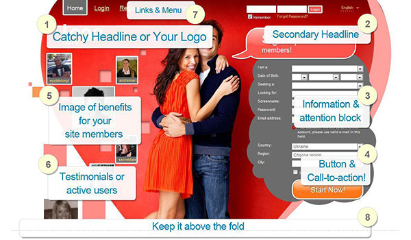
- Catchy Headline and/or Unique Logo.Unique Logo image with the name of your site should attract your visitors and make them remember your site. Users always appreciate unique original content that helps your site stand out from the dozens of competitor websites.Also try not to overload your page with over-optimized text content that contains all the relevant keywords but is hardly interesting for your visitors to read.
- Clear and concise Headlines. One of the first areas visitors will read on the landing page are the page headlines and these should not confuse or bore, but compel the visitors to take a closer look at what your site offers. Try to give it some emotion or a touch of humor to make it expressive and catchy for your particular traffic or audience on this site. Addressing a specific point that is related to the content of the website will grab visitor’s attention more than a vague and uninteresting headline.
- Information & attention block. Visitors pay attention (drawn with headlines) to information you give or a visitor is to provide (e.g. registration form). You can track and analyze the registration attempts statistics to see if your landing page needs enhancement in this part.
- After your visitors have read the Headlines and paid attention to information block, give them an obvious instruction on what to do next.Use strong call to actiontext that will be easy for the visitors to take. Such words as: “Free!” and “Now!” will get your conversion rate up significantly.Use brighter colors for call to action buttons – it will help to catch the viewers’ eyes.
Some webmasters currently use very small “Start Now”/”Register Now” buttons. A good option would be to try bigger buttons and see the results. - Place unique image/video or use standard template content that describes benefits of your site service. This will give new visitors a central major understanding of the benefits they get by registering with your site (beautiful partner, beloved person, sexual partner, ideal relationship).
- For an effective way of building trust, incorporate testimonials or current members’ photos to show new members real evidence of your site service and good results.
- Links (Menu Elements). Too many links to other sites or many menu elements could distract visitors’ attention. Try to keep the Landing Page as simple as possible.
- Keep it above the fold.The space a visitor sees without having to scroll is where the most important parts of the webpage should be.Place the call-to-action button above the fold and in a location where the viewer’s eye will scan toward. Never have the button in a place where it has to be searched for. Some partners upload large logo images that will shift or move down all the important-for-conversion site elements. We would recommend keeping as much of this expression as possible using a smaller image.
- Always be testing. Optimize your Landing Page for conversion over time. Run A/B tests, change images/video and call-to-actions to see what resonates most with the visitors of your particular site.
Landing page is the face of your site, the first place where new visitors make their decision if they bounce away or become your new happy members. Make sure that they see all the good reasons for them to become yet another story of a happy owner of the VIP membership on your site. So we wish you only perfect landings!
Serge Zhyrov,
Account manager
Dating Factory
All these suggestions are great!